NAME
Brand Name Usage
Official Name:
Edward H. Wolf & Sons, Inc.
Preferred Form:
E.H. Wolf & Sons
Accepted Variant:
E.H. Wolf
Common Usage Variant:
Wolf
allowed after full name is established in context
Common misuses to avoid: Edward Wolf & Sons | Wolf Oil | Wolf Lubricants | Do not use "Wolf & Sons" without the E.H. | Do not abbreviate as "EHWSI" or similar acronyms | Misspelling Wolf: Wolfe or Wolff
PRIMARY LOGO
True Power Mark
Used on official documents, signage, uniforms, digital media, and print graphics when space allows for clear and legible display.
PRIMARY VARIATION LOGO
Wolf Motion Mark
This is the most commonly used logo and is ideal for apparel, signage, promotional materials, digital, and general brand recognition—especially when the full logo would appear too small or visually cluttered
ICON LOGO
The W Mark


Used for app icons, favicons, social media profile images, or stamps
QUALITY STAMP
True Quality Mark


Used as a watermark, background graphic, or specialty feature in brand storytelling
Do not stretch, distort, or recolor logos | Do not place logos on busy or low-contrast backgrounds | Do not change logo opacity or add drop shadow | Do not stack or rearrange elements within the logos
BRANDING
The Wolf Color Palette
True Blue
HEX: #1571B7
CMYK: 89, 45, 0, 0
RGB: 21, 113, 183
Loyal Blue
HEX: #053F61
CMYK: 100, 69, 26, 74
RGB: 5, 63, 97
Alert
HEX: #FFB64D
CMYK: 0, 29, 69, 0
RGB: 255, 182, 77
Vivid
HEX: #ED3F1D
CMYK: 0, 80, 86, 7
RGB: 237, 63, 29
This is our secondary brand color
This is our secondary brand color for digital
This is a shade of True Blue
This is our primary brand color
White
Always allowed to compliment brand colors
Gray
Always allowed to compliment brand colors
Black
Allowed in select scenarios (text or design requirement)
MESSAGING
Taglines
Keeping you moving.
Premium-quality products since 1941.
At Wolf, excellence runs deep.
The road to success starts here. Let’s get you moving.
Do not overuse taglines or mix them together
MESSAGING
Brand Voice & Tone
Grit
We work hard, take pride in our effort, and own every job from start to finish.
Power
Our products and people deliver strength, reliability, and results.
Honest
Straightforward communication, no fluff.
Community
We're local, invested, and supportive of our people and customers.
Family
A business built on generations and relationships that matter.
Excellence
We set the bar in our industry and strive to raise it every day.
TYPOGRAPHY
Fonts & Type
Montserrat
Montserrat is the official font of Wolf. Montserrat is a sans-serif typeface and is used for all Wolf brand and marketing materials.
Rift Soft is the secondary font of Wolf. Rift Soft is a strictly uppercase font that is used for headings, names, labels and decorative purposes.
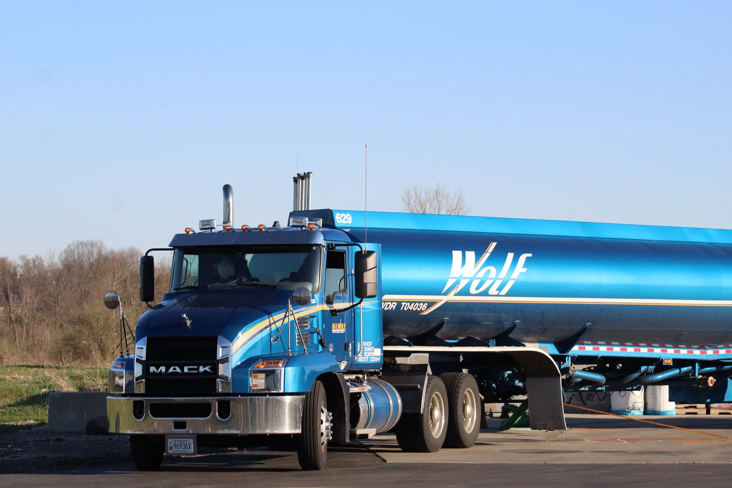
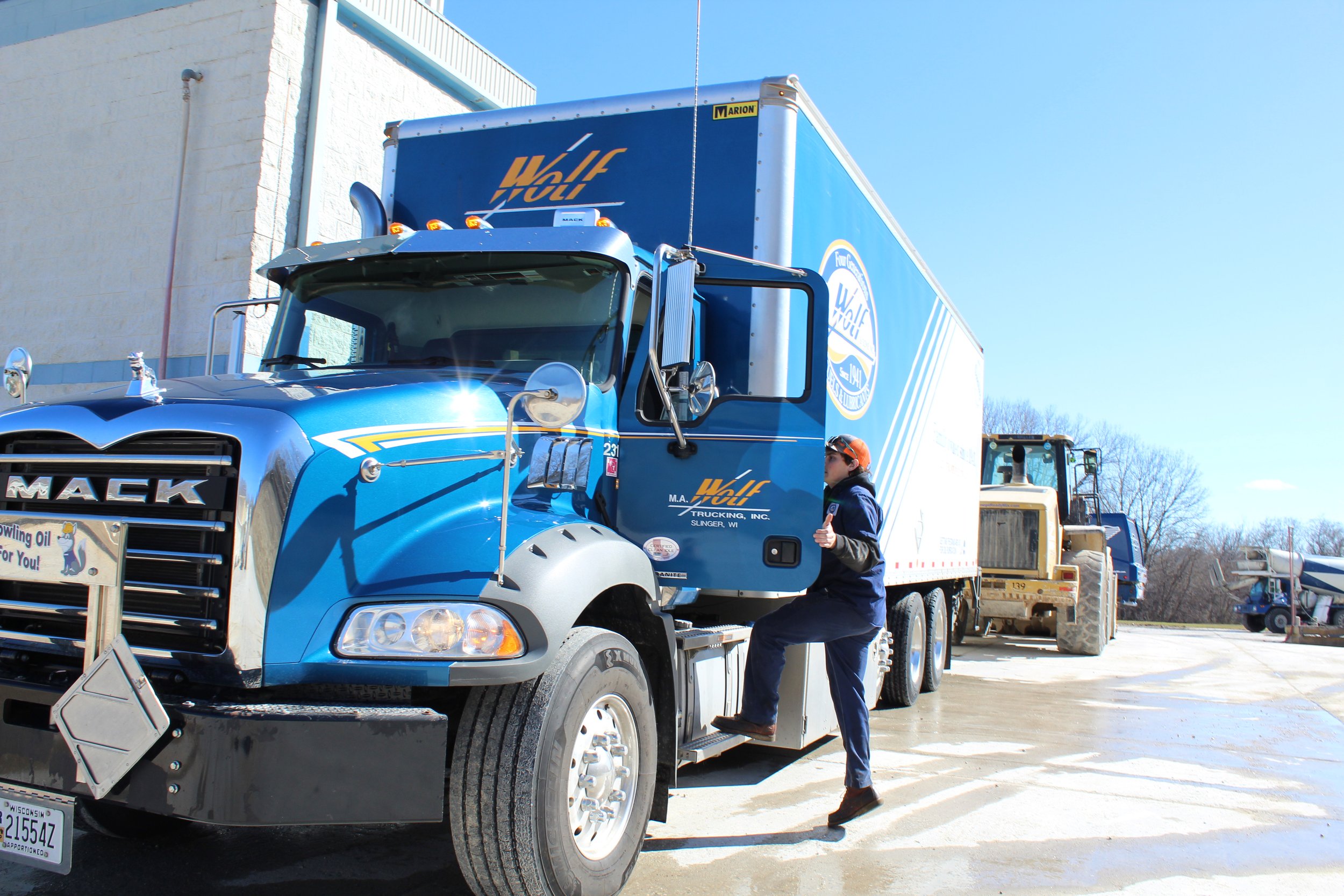
PHOTOS
Imagery Guidelines
All imagery should reflect the authenticity and strength of the Wolf brand. We prioritize real, high-resolution images featuring our people, products, trucks, customers, and locations. Stock photos should be avoided in favor of original content that showcases our industry in action. A balance between grit and polish is key—images should look professional but never overly staged or artificial. Clean compositions, minimal editing, and uncluttered backgrounds help ensure our visuals remain powerful and on-brand.